Using App Insights Analytics Query Language to Make Better Decisions
So we’ve been working on an App recently to complement our website. One thing I strongly believe in is data driven design or put simple: “Don’t guess gather evidence”.
In our current site we’re using App Insights to capture usage, performance and general telemetry from the platform. This gives us a wealth of knowledge which we can query when making business decisions.
Let’s jump in, I’m going to be using the new Analytics platform and its query language to understand more about our mobile users, specifically iOS, as an example.
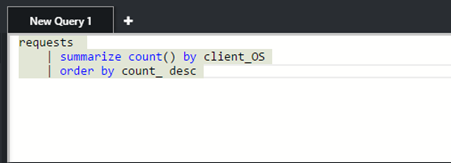
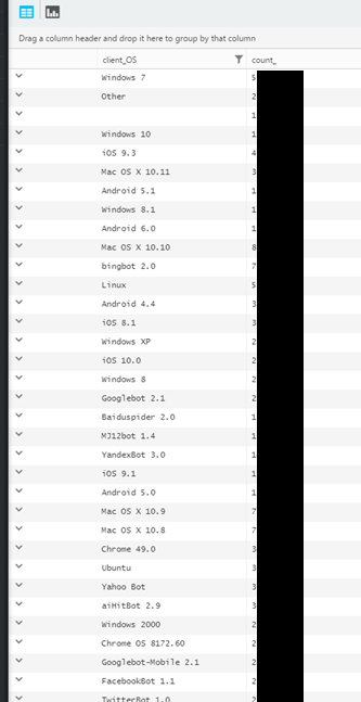
First up I’m going to run a query to get the numbers for each client OS we see on the site.
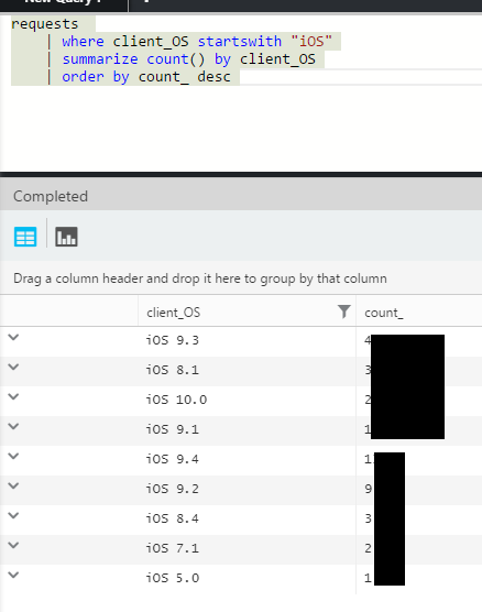
Now, as you can see in the results, iOS is split over various versions. Let’s narrow down the query to look at just iOS..
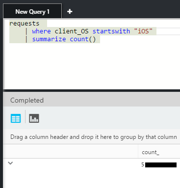
Let’s remove the grouping and see if we can find out what we’d lose by just targeting iOS9 upwards.
First up what are the total numbers for all iOS visitors?
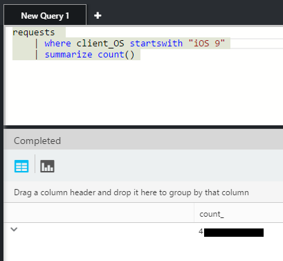
What about just iOS9?
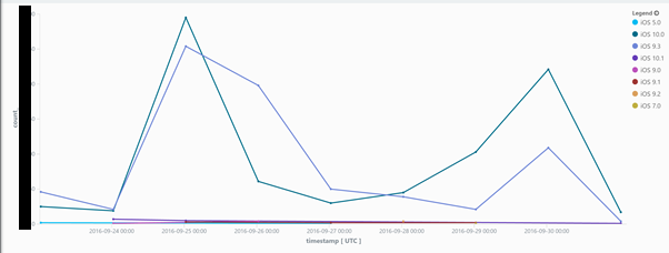
In our case this shows that 89% of our usage is from iOS9 and above. We haven’t taken into account time here so all the older iOS usage could be from way in the past. Let’s take a quick look at that.
So no feasible trend to be seen here, 89% stands.
At the moment we’re just looking at requests, so this number could be massively off if one user came and hit the site a lot on a single phone. We’ll use the dcount operator to do a distinct count by sessionID. This will only count each user session once.

This query showed that this wasn’t the case and the numbers we had are valid, so we can rule out a single user doing a lot of browsing and throwing off our stats.
At this point I realised that we’re using some SPA functionality and server requests doesn’t really map to pageviews so I switched to looking at page views to compare the numbers.
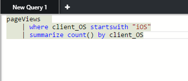
Sure enough this made a difference but the rations between the numbers where similar, 1 request generated x number of page views, where x is fairly constant.
Let’s next look at the split between device types, for this we’ll use the reduce function. It groups together similar variables to make things simple. For example, the jumbled list below:
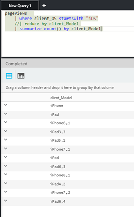
Becomes..
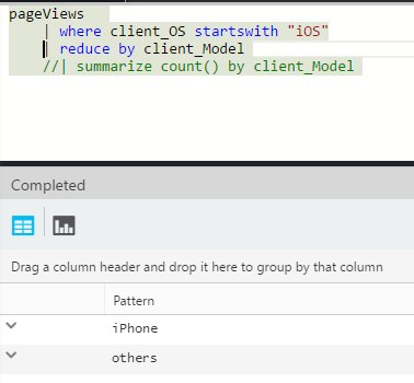
This is great to help understand patterns in data without having to do lots of where/group by’s. But in this case it’s a bit too extreme, I’d like “other” broken down a bit more.
By playing around with the “threshold” value I can make this happen. After tweaking the “threshold” value I found that 0.2 did the trick for me, I now have a breakdown of iPad vs iPhone
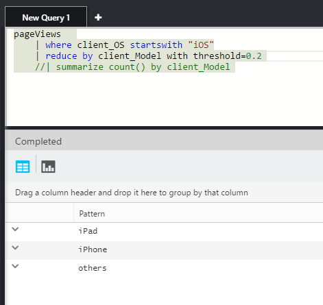
Roughly this showed a 50/50 split in iPhone vs iPad traffic for us over the time period.
Summary
89% of our iOS users are on iOS 9 or above and we have a 50/50 split of traffic between iPad and iPhone users. Now when making product decisions we can use this data to drive what and how we target the platform.
Obviously this is only a high level overview of the numbers we ran but hopefully it serves to illustrate some of the functions in analytics and how they can be used to inform better development decisions.
